Starlight Shadow Prototype
A downloadable game for Windows
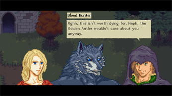
Carys flees from the burning of her temple but is pursued by a Bloodhunter, only to be saved by the mysterious wolf-man Bleddyn. Together, the two form a unique friendship, where they learn to open up about their pasts, in order to push forward to the future.
This is a prototype for a RPG that I made in a month in Godot Engine. I would like to continue working on it, but thought it would be nice to showcase everything I had done, and receive feedback on the systems I had designed.
| Status | Prototype |
| Platforms | Windows |
| Rating | Rated 5.0 out of 5 stars (1 total ratings) |
| Author | DeviSerene |
| Genre | Role Playing |
| Tags | 2D, Fantasy, Female Protagonist, Furry, Pixel Art, Singleplayer, Turn-based |
Download
Download
StarlightShadow Prototype.zip 108 MB
Development log
- New Demo!Jun 29, 2024
- Project PrototypeMar 29, 2024


Comments
Log in with itch.io to leave a comment.
I really enjoyed playing the prototype! I'm the sort of person who plays RPGs for the story but I found the combat interesting. I think that already says a lot about where this is going <3
I did have to restart the game since I lost in the boss battle the first time around. The big bramble kept summoning little ones and I was doomed! The solution was to kill it early the second time around, but how the boss battle will play out won't be clear until you see it in action. In my opinion it would be good to have a "Retry battle" option if you lose a battle, it would go especially well with the fact that you start each of them fully healed. I think it will add a lot to the experience even when you have your save system implemented.
Speaking of which - I do enjoy that you start every battle fully healed. I think it reduces a lot of friction compared to classic turn based RPGs where you would have to go to the menu and heal your characters manually.
Story wise, I think it works but as someone who plays games for their story I felt like I would have enjoyed if some conversations were a bit more in-depth. It's a game, so I completely understand the issue of having to balance story and gameplay content. But it's that, it's all about the balance. And people will love when you integrate story and characters with gameplay, which you already do very well - I think what made me really care about Carys and Bleddyn and where the story will go was that last boss battle.
So, to put the above into more concrete thoughts. It's good that the story portion before the first battle is brief, but afterwards I felt like the part where they bury the priestesses was a bit rushed. It's a big emotional moment, you can use these to show more about the characters to the player and make them care. Instead, I felt like the focus was on showing that Bleddyn is a very caring individual. I don't recall the exact words, but the line where Carys said "you dug graves, that's very kind of you" took me back from my immersion because I felt like she would say something or act in a way that reveals more about how she feels about the situation, rather than tal about what Bleddyn has done for her first. Is she angry, is she sad, is she trying to restrain her emotions? You've got a great opportunity here to tell us more about her.
The fact that you went for very different manners of speaking for Carys and Bleddyn surprised me, and I like that. It's difficult to give each character a different voice but you carried that task really well and the speech comes across as natural.
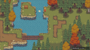
I really like the map art, it does give those autumn color vibes. Character portraits too, I can see that Fire Emblem inspiration in them and I love that. I think colour wise, portraits could do with more hue contrast between the different shaded sections. Think about the light - sunny days will have warm yellow light, which will translate into shadows with a blue tint, sunrise will have orange light with purple shadows, artificial light can be anything. Colouring with that in mind can give art a specific vibe and I think it makes it pop more overall. If you want an example, the illustration I sent you the other day is more of an orange-ish light one with purple shadows. I used layer effects (multiply, overlay, etc) to shade it but layer effects can help a lot when picking colours for pixel art, too!
I don't know what you're doing to resize the screen and keep the pixel art looking good, but I like it. It still looks really crisp!
Overall I think this project has a lot of potential and I'm looking forward to playing more when you release the full game, or when you make another prototype! I want to see what Carys and Bleddyn get up to next!
Very fun prototype!
UI is really smooth. Particularly love the interactables that only appear as you approach. Makes me want to explore more. Character movement in cutscenes is a nice touch too.
The music is a good fit, but the combat music does make me want to play Backpack Battles :P
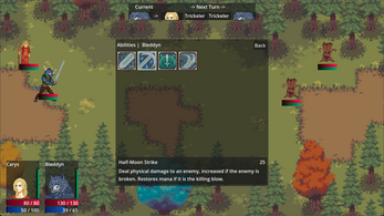
Menu and skill trees is intuitive and easy to navigate, but not being to equip items from the Inventory feels a bit awkward.
Some way to see status effects on allies and enemies might be nice. Like an Examine action?
Combat balance seems good! Abilities feel distinct and situationally useful. Feels like learning the enemies attack patterns is useful. The combo move is a cool concept. Interested to see other combos with other pairs of characters later!
The story also seems really promising! Excited to see where this goes.
Keep up the great work :D
Thank you so much for playing, and also for this incredible feedback! ^.^
I'll definitely add a Inspect/Examine mode in battle and being able to equip items (or go to the load out UI) from the Inventory screen will be a big improvement for that screen.